
Slow Balanced Living
Slow Balanced Living is a holistic naturopath clinic based on NSW’s Central Coast, offering an approach rooted in balance, harmony, and sustainability. Seeking a brand that would embody these values, Slow Balanced Living wanted a visual identity that reflected the holistic nature of their practice while conveying a sense of grounded calmness. We were tasked with creating an identity that would align with this ethos, using intentional design to communicate the practice’s core philosophy.

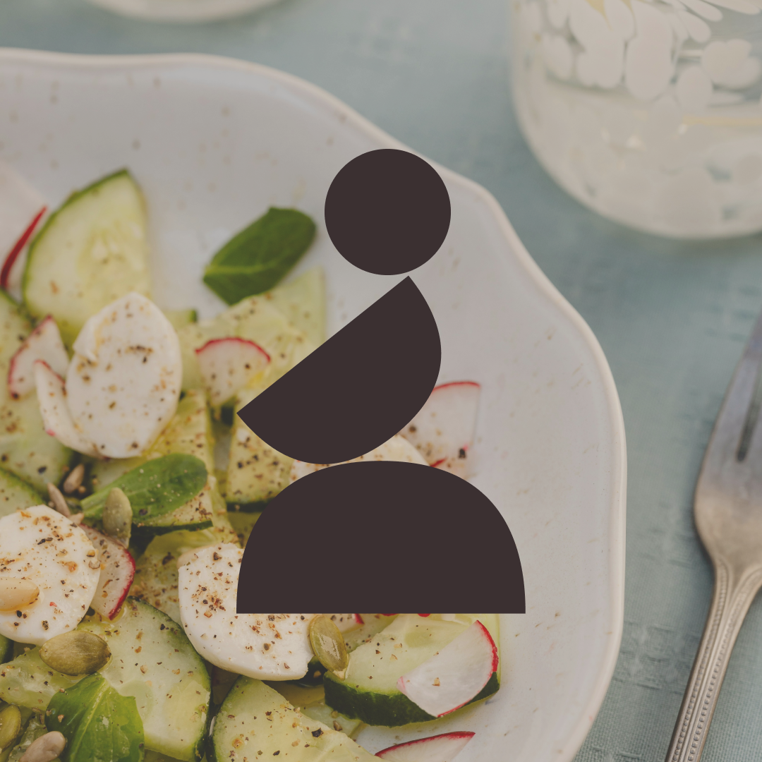
Organic shapes became the foundation of the visual identity, carefully composed to evoke a sense of ease and interconnectedness. Each element feels deliberately placed—like a reflection of the harmony Slow Balanced Living helps its clients achieve in their lives. Soft, earthy tones were chosen to communicate tranquillity and connection to nature, while clean typography ensures an approachable and modern feel. The logo design features shapes gently balanced upon one another, symbolising the sense of balance and harmony clients seek through the clinic’s services.
The resulting brand identity captures the essence of Slow Balanced Living, creating a cohesive visual system that extends across all touchpoints—from business cards to the website. The soft colours and harmonious forms reinforce the practice’s values, building trust and familiarity. Every element works together to create a brand that feels calm, approachable, and rooted in nature, perfectly aligned with the holistic and sustainable ethos of Slow Balanced Living.


Service
Art Direction, Branding, Digital, Print & Packaging Design.
Industry
Holistic Health, Wellness.
Year
2022